Taking the world's temperature
September 2010
Mean planetary temperature is an abstraction, in the same way “the average Australian male” is. It is a handy concept which points to what really matters – the amount of heat in the planetary surface and atmosphere. Just as we don’t expect to meet the average bloke in the street, you don’t experience the average climate anywhere – but in a sense it is there just the same. It might seem strange that warming the planet by a degree or two can be such a big deal – you can experience more change than that in moments when a cloud passes overhead – but the amount of heat needed to warm the surface of the globe this much is very large, and that is what counts. The reason we don’t experience this quantity is that it is “hidden” in the ocean; all we feel is the temperature of the first metre or two of the lower atmosphere.
Where is the temperature measured?
Our perception of ambient temperature - what we all experience (or measure) directly – is the air temperature a metre or two above the planetary surface. This, usually called the near-surface temperature, is what is monitored by the research centres which keep track of global warming. Weather observation stations have existed, especially in North America and Europe, for over three centuries, but a network sufficiently representative and dispersed to infer the global average is much more recent – about 140 years at best, certainly in the Northern hemisphere; good data from the southern hemisphere and the oceans have been much less complete until well into the 20th century.
Only a quarter of Earth’s surface is dry land, and of that, humans only inhabit a part, so the global picture must be filled in with measurements of ocean-surface temperature; and sparsely inhabited places (deserts, mountains, the poles) must be sampled by dedicated observers and satellite born remote sensors. Understanding exactly what the surface temperature means requires knowledge of how heat is distributed in Earth’s heat reservoirs, primarily the deep ocean – so in recent years oceanographic programs have been tracking the profile of temperature there. The upper layers of the atmosphere are sampled directly by balloon-born radiosonde instruments. How the mass of data from thousands of observations is turned into a global mean, corrected for various errors and biases and updated regularly is the complex business of several major research centres in both hemispheres. The three main ones are:
The Climate Research Unit, University of East Anglia,
NASA’s Goddard Institute at Columbia University,
The National Oceanic and Atmospheric Administration (NOAA).
The three use somewhat different methods to synthesise their data, but still arrive at essentially the same result. There are also major international initiatives to coordinate all the monitoring work that takes place in these and dozens of other institutes, to maximize the value of the output. Each of the centres maintains an excellent website where their findings can be found as soon as they are processed, along with a great deal of other valuable stuff.


Finding the mean
To get thousands of local observations to yield a single number requires great attention to detail, and a very good understanding of the way the climate system works. Since nobody understands this perfectly, researchers routinely collaborate in order to better detect sources of error. A statistician works out how many observations are needed in each region of Earth’s surface, and where they are not available, how to correctly compromise for the missing data. Observation sites are obviously most dense where there are most people – but this can produce biases due to the local and regional heating effects of cities. Ways must be found to correct for this. Observations vary in quality from place to place and over time, and this too has to be allowed for. Observing at sea has its own problems, especially non-uniform sampling methods over time.
The statistical techniques used for averaging have to be worked out – some of them by trial; and because the global climate system is full of sub-systems with their own dynamics, the whole data matrix ideally should be capable of distinguishing trends within those. All direct observations are now supplemented with satellite-based remote-sensing data, and this has potential to greatly improve reliability and consistency. There have been teething problems with the integration of these new techniques, but nothing we’ve learned from them has changed the emerging picture of rapid warming.
What does it mean?
Temperature is only a symptom of what really counts – the positive imbalance in the Earth’s energy equilibrium. In its unperturbed state, the Earth/atmosphere system radiates back to space the same amount as it receives from the sun, and so sustains a constant mean temperature. When our measurements indicate warming, it is because, for the time being, more heat is being retained in the system than is returned to space.
Over the long history of the Earth, imbalances, both positive and negative have happened many times – sometime due to variations in solar output or Earth-orbital cycles; sometimes due to terrestrial events (tectonic activity, changing atmospheric composition, extra-terrestrial collisions, etc). The scientists concerned about climate change understand this very well – though to hear the sceptics you’d think they were the only ones to know. What is so different about the current trend is that the warming is driven, as far as we can tell, by greenhouse gas injection alone; that it is very rapid (in terms of Earth history); that it is happening during an interglacial, when the Earth is already warm; and that this same period (the Holocene era) is the climate setting for all of human civilised experience.
All our food production systems; all our vast network of resource procurement and distribution; all our geo-political arrangements for balancing influence and power; all the environment-management works we’ve constructed to make urban life possible; and all the free services we expect from functioning ecological systems – all these and more depend on the kind of climate we’ve been used to. We are now struggling to understand how all of them will respond to the changes that are coming.

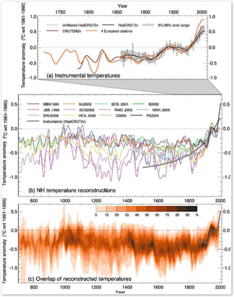
This chart, from The IPCC AR4 of 2007, probably summarises what is known about 20th century warming as well as anything. Several high quality proxy studies were used to make it (they are shown separately in the middle figure). The lower one gives an estimate of the extent they coincide. At the right of each graph, the record of instrumental (thermometer) measurements is given, showing that, for this period at least, the agreement between proxies and observations is good. The vertical scale shows the difference between recorded temperature and a reference period mean (1961-1990): so-called ‘temperature anomaly’. The clear implication of these findings is that 20th century warming is a singular, new and rapidly developing climate phenomenon.
A couple of false claims about global temperature.
Because it is such a telling piece of evidence, the temperature record has earned some criticism from “sceptics” – some of it silly, some misguided, some passionate and all of it ignorant of the real state of our knowledge about this subject. Here are a couple of those most often repeated.
It was warmer in the middle ages
We can’t know the medieval climate from direct evidence (there were no thermometers then), but there is plenty of historical evidence, as well as high quality proxy data to show that there was a warm period (the Medieval warm period or MWP) from roughly 900AD to about 1350AD. These were not a succession of warm centuries; rather, it was a time of intermittent warming, with an overall warm trend – the northern hemisphere temperature at 1000AD was probably about 0.1C above the millennial mean, or very close to the global mean at 1900AD. Whether the entire globe was warmed to the same extent as the northern hemisphere (from which nearly all the data are drawn) is still debated, but most likely the effects of this period were unevenly distributed. There’s reason to think that parts of northern Europe warmed as much as 2.5C for decades at a time, before cooling and then returning to warmth perhaps several times during the four or five centuries the phenomenon lasted. We don’t know what caused it, although it will probably turn out to be a small change in the solar flux induced by a phase of the orbital cycle.
The graph above shows the best proxy record we have for the period. None of the available data shows that the MWP was hotter than now. Sceptics who assert the opposite do so falsely. No accredited evidence exists to uphold this claim. It is also sometimes claimed that the warmth of the middle ages produced great benefits for humanity; hence future warmth will do the same. This is only a little bit of the truth. Agriculture in northern Europe seems to have done well from the heat; but other parts of the globe suffered mega-droughts which did enormous damage. Heat is neither good nor bad. Its human consequences depend upon whether there is time and room for adaptation.
As an example of the nonsense that is written about this, you could read Professor Plimer’s new book, where, on page 89 (without acknowledgement), he adduces a graph labelled “Climate changes in Europe over the last thousand years”. It shows a peak around AD1300, about 0.6C warmer than the 20th century average temperature. This is supposed to clinch his case that the MWP was hotter than the present. But it does nothing of the kind. He says it was derived from “hundreds of studies”; it was not. It was drawn in 1965 by Hubert Lamb, an early climate scientist who used non-quantitative data to illustrate an inferred climate for central England toward the end of the MWP. Lamb, having none of the technical apparatus of modern paleoclimatologists, made his reconstruction by detective work – brilliant at the time, but by no means adequate today. Lamb’s data has in fact been re-analysed with some modern assistance, and found to be substantially correct. But it was only ever meant to refer to a smallish region of the British Isles; it tells us nothing about the global mean, and the fabricated climate history Plimer wants us to believe is absolutely refuted by all of the best evidence now available. Brian Fagan, author of a couple of books on the MWP and much better informed than Plimer, uses the graph I have given above.
You can read an interesting article on Hubert Lamb's work on the MWP here:
Twentieth century warming is an artefact of the ‘urban heat island effect’.
Cities are generally hotter than the countryside because pavement and buildings absorb heat, and people and machines radiate it. So weather stations sited in cities, or those that have been surrounded by urban sprawl over time tend to record higher temperatures than those in nearby rural sites. However, the effect is by no means a simple one (some cities are actually cooler), and great care needs to be taken to remove the bias. It was known to climatologists long before “sceptics” began to argue about it this way, and to suggest as they do, that the people who spend their careers improving climate monitoring methods either ignore it, or are so sloppy that they forget to compensate for it, is absurd.
Any sceptic who claims all of the recent warming is due to measurement error must still explain why the uninhabited places (oceans, Siberian tundra, arctic ice and the Antarctic Peninsula) are warming, and also tell us what is causing the plethora of warming effects on glaciers and the bio-sphere. To deny that these exist is both blind and ignorant.

Only 30 years ago they were warning of an ice age; they don’t know what they’re talking about.
It is perfectly true that the rising temperature trend from 1900 to 1940 was stopped, and in the northern hemisphere, reversed, for about 30 years before resuming about 1979 (you can see this in the chart below). Toward the end of this interval, some of the scientists who’d been concerned about warming came to think that instead a long-term cooling trend had begun, and the subject entered the popular media in the late 1970s. However, there is not the slightest doubt that it was a temporary reverse in a long-term warming trend – not the other way round – and that it is well and truly over.
What caused it is still subject to some debate, but the strong consensus seems to be that it was at least partly due to the sharp increase in industrial atmospheric pollution beginning during World War II and continuing through the post-war boom. Suspended air-born particles, especially soots and sulphate aerosols, reflect sunlight or else absorb it in the atmosphere, preventing it reaching the surface, & inducing cooling. This is part of the phenomenon usually referred to as “global dimming”, a subject of much current study. Around the end of the 1970s western industrialized countries began to clean up their industrial pollution, and so reduced the effect. A few experienced investigators had understood this at the time, and correctly predicted the temperature turn-around.
The troposphere is cooling, so the world can’t be getting hotter.
This often heard claim is another example of a falsehood made from a half-truth. In 1990, two scientists reported a study of retrospective satellite data which found no warming trend in the mid-lower troposphere between 1979 and 1990. In theory it should have warmed about the same amount as the surface – about 0.2C. It took some years for a correct technical explanation of the discrepancy to emerge, and it turned out to be fairly complex; but as of 2001 there’s been no anomaly in these measurements, and the persistence of this assertion now is due to either ignorance of perversity.
The world has been cooling since 1998
This claim has been around for a while. At first, it was simply a statistical non-sequitur, made either in error or deceit. 1998 was the strongest El Nino recorded - it still is. It was also the hottest year (annual mean global temperature) recorded to that time. That record has been broken a couple of times since, but it was certainly an exceptional year, with many grave consequences. To claim warming stopped then is just to say that this record year was not followed by another record for a few years - which is correct - but hardly news. The climate system has lots of natural variability.
The 1998 record was surpassed in 2005 and again in 2010. You can see in this table from Wikipedia by how much each of the hottest 10 years exceeded the 20th century mean.
In the chart on the right you can see that, since 1970, each decade, including the present one, has been hotter than the prior one by about the same amount.
The only way to uphold the claim about 1998 is to draw a line on a temperature chart, starting with that hot year, and make it look as if the line is flat.
This is easy to do, but proves nothing. The temperature record is full of intervals of a decade or so with little or no warming. It can easily be shown that this is normal behaviour for Earth's climate system.
However, there is another issue, which only became the focus of these claims a bit later. A very real change in the rate of warming has occurred since about 2000, which was not foreseen by scientists and has generated a lot of searching for its cause.
We now know it is not due to the Sun; it's not because the causal relation between CO2 and temperature has been misunderstood; it's not due to volcanoes; and it's not because we've stopped forcing the climate. The evidence overwhelmingly implicates the pattern of Pacific Ocean temperature, mediated by the so-called Pacific Decadal Oscillation, and some other recurring modes of natural climate variability.
The Pacific, holding almost half the water on Earth, is the planet's biggest heat reservoir. So it has a big effect on the climate of the whole world. The last dozen years have been dominated by a La Nina pattern in this ocean, when a large pool of warm equatorial surface water is sustained on the western side of the ocean. According to the most recent findings, a change in the strength of tropical trade winds seems to have transferred heat from this warm pool into the deeper ocean (below 700m) where it is out of contact with the atmosphere.
This is shown in the bottom graph, created with data from the Argo float system of deep ocean observations. Simply, it tells us that, since the turn of the century, the deep ocean has been warming faster than the surface - and therefore less ocean heat is exchanged with the air.
The diagram above it, shows the pattern of the El Nino oscillation. The measured trend of global mean temperature is marked by the red broken line. It is close to 0.1℃ per decade (down from 0.15℃ between 1975 and 2000).
In summary, the truth about this fraught question is that warming of the near-surface air has slowed in the last decade or so; scientists didn't expect it and were genuinely puzzled for a time; they have sought evidence for the answer and apparently found it. The episode is normal in Earth's climate system, whether it is being forced or not, and in fact, variation of this magnitude was foreseen years ago. It just wasn't immediately recognized when it occurred. It does not mean warming has stopped.
Both graphs are from an excellent review of this topic by Kevin Trenberth & John Fasullo at NCAR. You can find it using the link


How can a couple of degrees make so much difference? Is this really an emergency? Couldn't we just cope?
If questions like these have bothered you, you're not alone. It's a genuine puzzle, and looking for a solution, you can learn a bit about the nature of this problem.
If you want to take the trouble, there's an essay devoted to this here.
You can follow the work of the three research centres by using these links
CRU
GISS
NOAA
This is one of the more persistent falsehoods, and it's hard to avoid if you're looking at the internet. This link will get you to a few pieces by folks who do know what they're talking about.
There's a good article series dealing with several common climate "myths" at New Scientist here:


This interesting recent study, from Steve Sherwood's team at the University of New South Wales, seems to have discovered a reason for the transfer of extra surface ocean heat to the deep - and quite possibly a climatological explanation for the temporary warming slow-down.